Festival Brand Design
Problem System
Research existing festivals and find one with a clearly unsuccessful visual identity. Redesign its visual identity to make it more successful, while still maintaining the festival’s purpose and core values.
Concept Statement
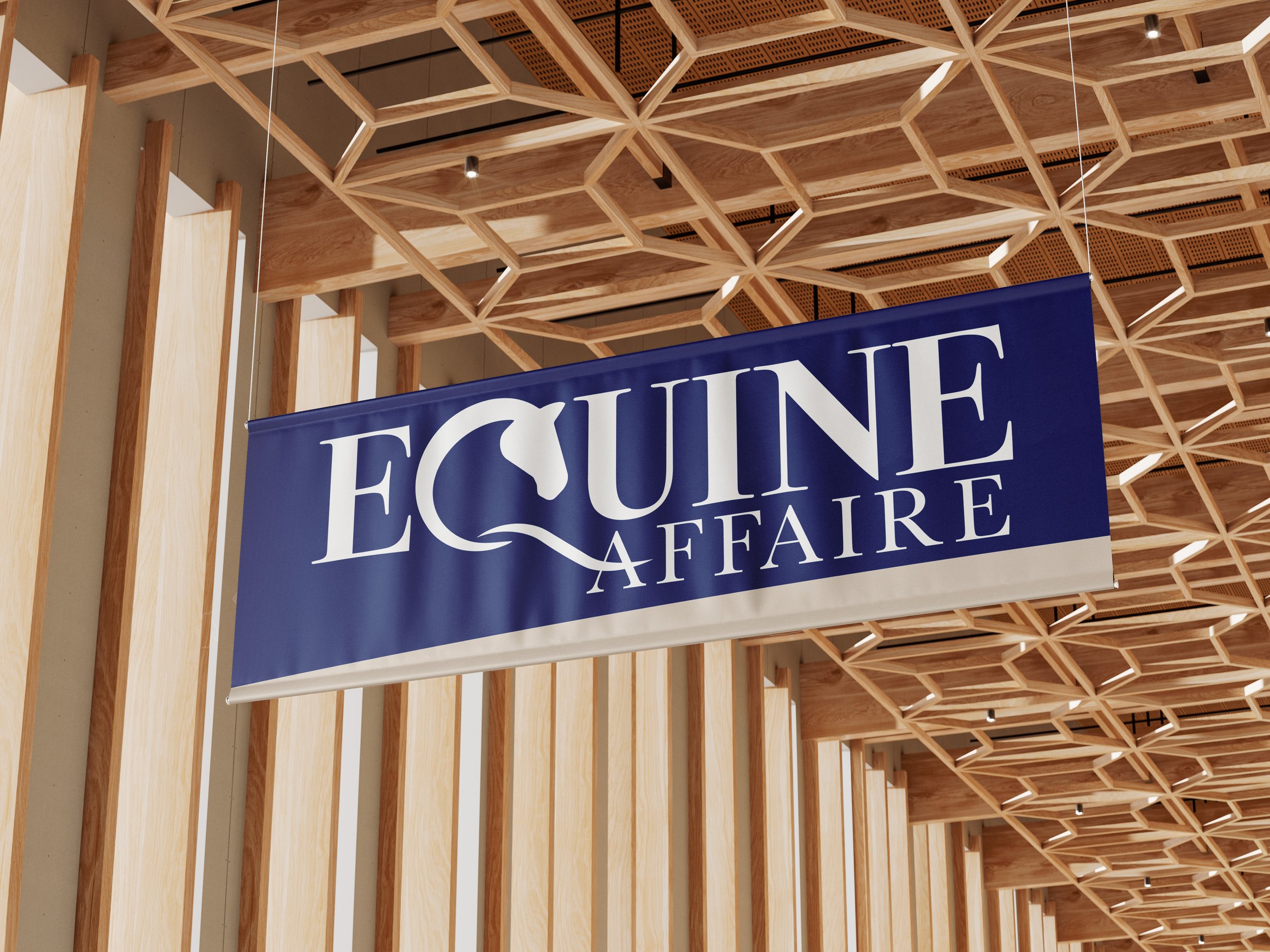
The Equine Affaire is an event with the purpose of “creating a first-class, education-oriented horsemen’s exposition in which horse people representing all breeds of horses and all equestrian disciplines would convene in a non-competitive environment and share their passion for horses”.
With my redesign, I wanted to express the sophisticated nature of the Equine community, but maintain the sense of welcome to anyone who wishes to join.
Current Brand Identity


The current visual identity is unsuccessful because the color palette is not consistent, muddy and aren’t visually appealing. There are too many different colors being used that hierarchy gets lost.
There are also two different logos, both with different colors and different typefaces. There is no consistency.
Color Palette

Rough Sketches


I wanted to explore this idea some more, but felt the current execution was too busy and cramped.

Exploring Variations


Final Wordmark


The Color Palette
Equestrians will often choose their own coats based on the color of their horse. I researched what the most common Equestrian outfit colors are, and based the brand color palette off of this.
www.countryandstable.co.uk listed their suggestions on the type of color schemes to suit coat colors. I found a common color being listed to be blue.


